The Purpose of Design
There are two main components to any website - design and content. Content is the information, images, sound or videos that are contained within the site. Good content will encourage people to keep coming back to your site or carry out a specific action such as making a purchase or contacting the company.
Content must be consciously consumed for it to work, and it takes time.
Design works completely differently. It is not consciously consumed but sub-consciously interpreted and this takes no time at all. Research tells us that when someone views a website it takes just 50 milliseconds for them to make an impression about your business. Once a first impression is made it takes a lot to change it, therefore having a design that matches the ethos of your business is essential.
This is all sounds very scientific but what does it actually mean for your hostel website? It simply means that you need to know what type of hostel you are and how you convey this using design. The purpose of this article is to show you how to achieve this quickly and easily.
Decide Who You Are - Defining Your Brand
We have now established that design is used to convey the personality or soul of your hostel to the visitor. So before you make any design decisions you are going to need to clearly define the personality and soul that you want to convey.
This is not rocket science, just think about who your customers are and what you offer. Are you a traveller hostel that offers a unique experience? Are you a boutique hostel that attracts people looking for luxury? Are you an adventure hostel that attracts thrill seekers?
Thinking about your customers and what you offer them will quickly give you an idea of who you are and what your business is. Another question that can help define your brand is asking “What makes us different from our competitors?”. As soon as you know who you are and what you offer, you can start expressing it through design.
Colours
We could talk forever about colour theory and how it affects design. Often when we talk about colour theory in web design we talk about using specific colours for specific elements or using a specific colour for a specific product. For the purposes of this article we simply need to choose a brand colour for your business, and then find colours that can complement or accent this colour.
Brand Colour
Our aim here is to pick a primary colour or a “brand colour” for your business. Of course, you can use more than one colour on your website; however, as you will have seen with products that are branded well or a beautifully designed website you will often use one dominant colour. Different colours evoke different emotions. Below we can see a rough guide as to how colour can affect our emotional state:
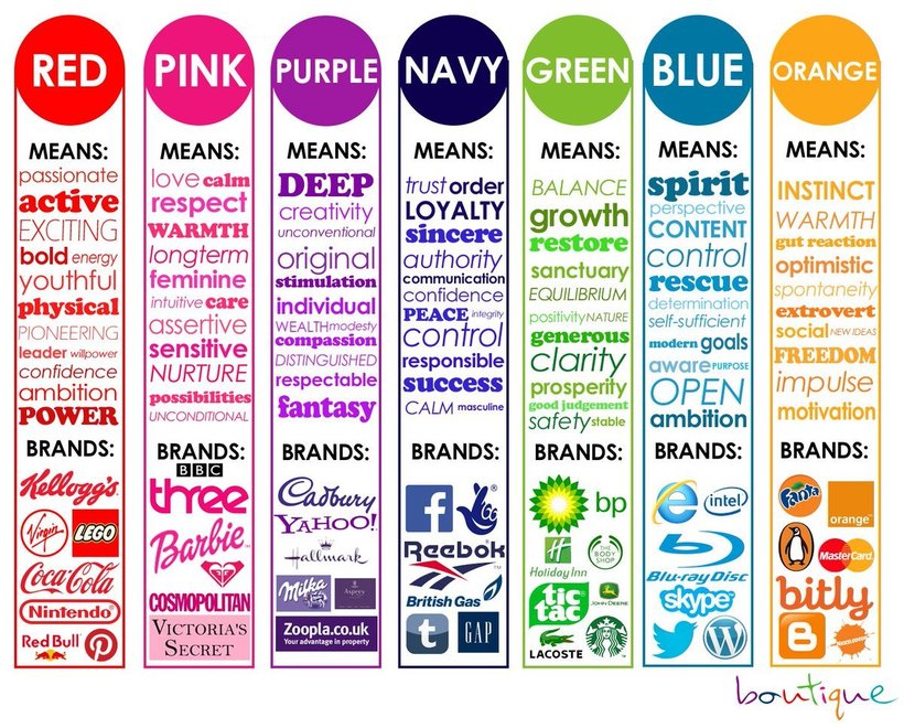
As a general rule, a hostel will want a strong colour. Dark colours can be used for luxury, and pastel colours can be used for boutique hostels but generally speaking you will want a bright, bold colour.
Examples:
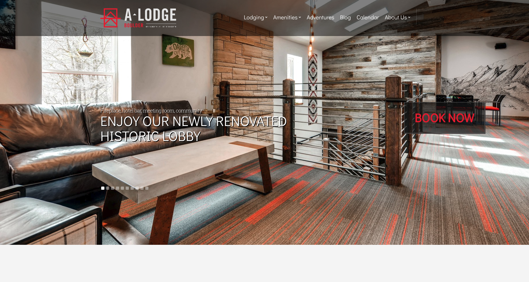
Here is an adventure style hostel that has used a bold red as their brand colour. If we look at the colour chart above we see that red is associated with the words “active” and “exciting”.
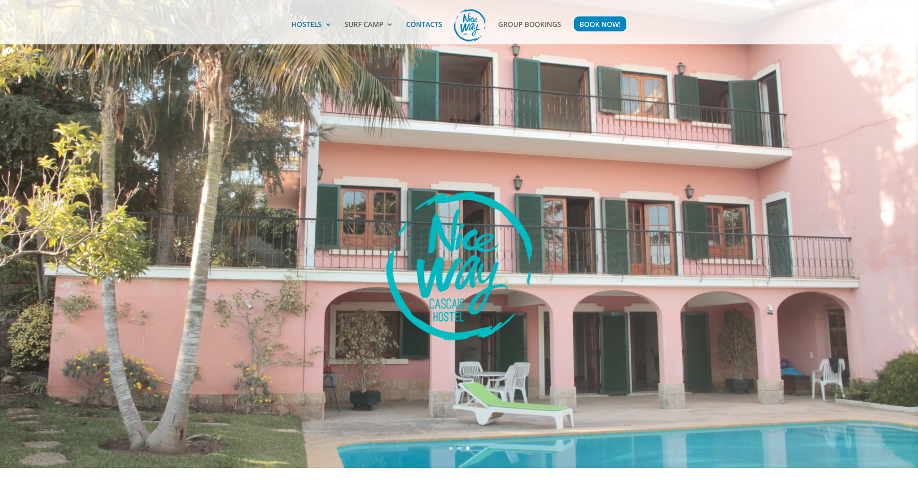
The following example has used a blue and particularly a pastel blue rather than a strong, bold blue. This hostel is a luxury hostel on the beach so they have used blue to convey relaxation and the pastel gives it a more sophisticated edge.
Finding accent colours
An accent colour is a colour that you use in your design to attract the visitor's attention to certain elements and make things literally stand out and come off the page.
Accent colours are not essential, in a lot of cases people will use their brand colour as their accent colour. Simply put they will use black text with a white background and then use their brand colour for buttons, links and headings.
If however, you feel that your hostel website design needs another colour to highlight elements or simply complement your brand colour then there is a painless way to do this. What you need to do is head over to https://color.adobe.com/create/color-wheel/ and put the hex or rgba value of your brand colour into the input for the colour in the middle of the five colours.
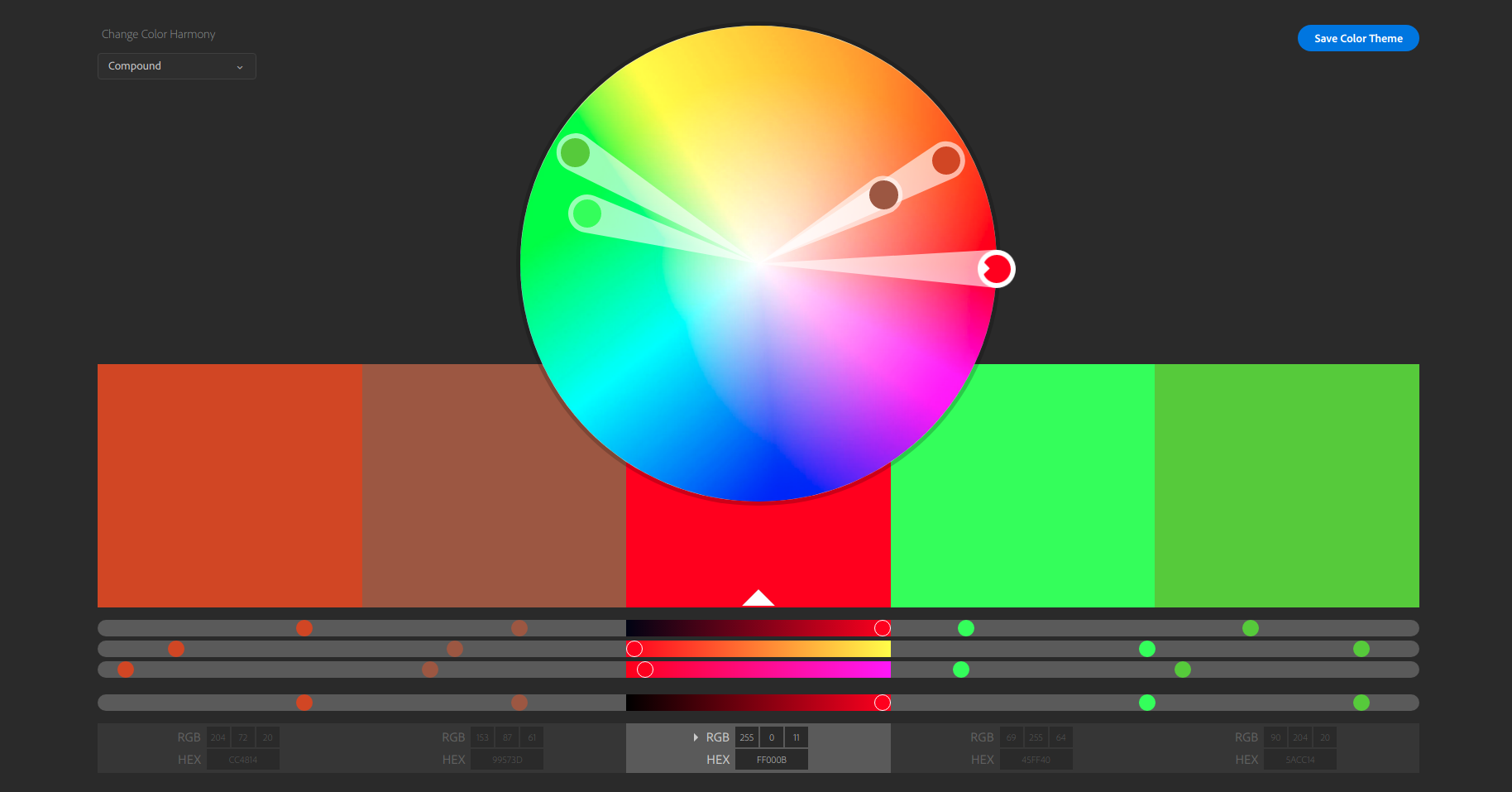
At the top left you will see a small dropdown labelled “Change Colour Harmony”. To find an accent colour you can select either Analogous, Triad or Complementary. These options will give you some colours that are different yet complementary to your original colour. Sometimes you will simply use a different shade or tone of your brand colour as a complementary colour. For this select “Monochromatic” or “Shades” then pick a colour that works best for you.
So there you have it, how to pick your brand colour and how to find an accent colour to go with it. Now we move on to the second most important factor in conveying your brand - fonts.
Fonts
As with colours we could go into a lot of depth about fonts but rather than go into a detailed explanation of typography lets just go through what you need to know to choose the right fonts for you.
Serif and Sans-Serif
Have you ever wondered what serif and sans-serif actually mean? Well, a serif is a little line on the end of a stroke within a character.
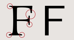
Serif fonts are fonts that have these lines and sans-serif are fonts that do not.
Font Pairing
Font pairing means choosing two fonts that complement each other well. Usually, you would use one for the headings and the other for the body text. You can use more than two fonts within a website but it is not necessary. Using one font for all headings and another one for all the body text throughout your website will make for a consistent, professional design.
The following rules are very general and have many exceptions but we are just trying to give a general idea so you can pick two fonts for your hostel website and get on with your life!
Serif fonts, the ones with the fancy curls and lines, are not normally used for body text. This is especially true when talking about hostel web design. If you are a very high-end or boutique hostel then you may use a serif for the body text, but more often than not you would use a sans-serif (without the curls or lines).
Another general rule is that you would not use a sans-serif or serif for both header font and body font, you would normally alternate and use one of each as this creates a nice contrast. The idea of font pairing is choosing two fonts that are not similar to each other so they create contrast but are not so dissimilar that they clash with each other.
As we have just said that in most cases you would use a sans-serif for the body this means that you would have to use a serif for the heading. You can, however, use two sans-serif fonts as both body and header, not only this but you can actually use the SAME font for both header and body.
Does all of this sound way too complicated? Would you prefer if this were just a two-minute job then get on with your life? You’re in luck! There are many web pages where they have already done the pairing work for you and all you need to do is simply pick a font pair that you like.
The following are two great sites to find a font pair to suit your hostel:
https://fontpair.co/
https://fontjoy.com/
Examples:
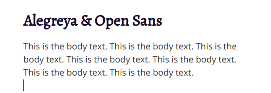
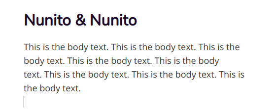
Here we have three examples of good font pairing.
Sans header with serif body text:

Serif header and a sans body text:
And, finally both header and body with the same sans font:
Real World Examples
We have now covered quite a bit of theory and given a few examples. In this section, we want to make everything that we have covered crystal clear.
There is no better way to do that than see it all tied together with design examples.
Budget
A budget hostel needs to convey simplicity and value. This can be done with a very clear design using just white, black and one primary/brand colour.
Pachamama is a budget hostel in Cusco, Peru. They have created a very clear design with one brand colour and one accent colour, they have used the same font for both headings and body text.
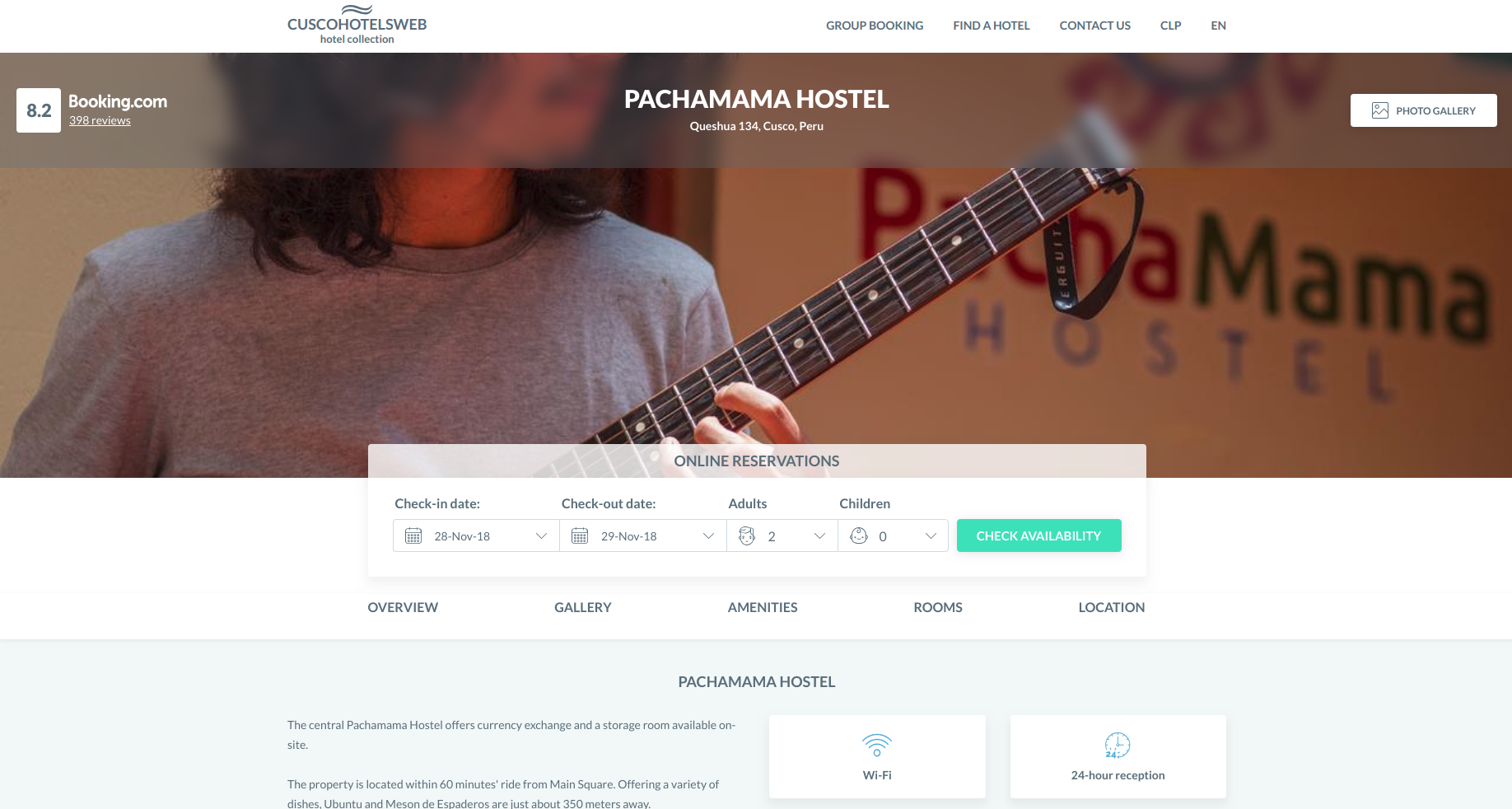
Colour Palette: Green (Brand Colour), Blue (Accent Colour), Black, White
Font Pair: Lato (Sans-Serif) for both headers and body.
Boutique
A boutique hostel probably has the hardest job here as the whole point of a boutique hostel is that they have a very specific personality. Therefore there are no hard and fast rules for a boutique hostel web design. You can not lay out specific rules for a boutique hostel because it could have one of many different personalities. Normally you would use striking colours and a design that stands out from the crowd and looks different.
The cube hostel in Berlin is a great example of a boutique hostel website done right. They have used black and white with red as their brand and accent colour. They have used fonts that you don’t normally see to set themselves apart and look different.
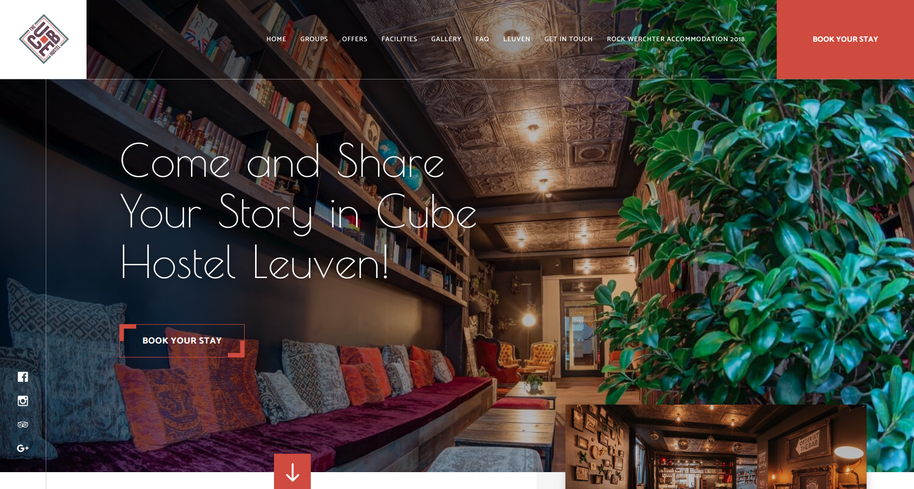
Colour Palette: Red (Brand Colour), Black, White
Font Pair: Poiret One (Sans-Serif) for Headers, Catamaran (Sans-Serif) for body text
Party
A party hostel has a very specific brief and therefore makes it a lot easier to define a style. Obviously, a party hostel is aimed at young travellers that want to meet people and have a good time. The key here is big bold headings, plenty of photos of people within the hostel, and a bright bold colour scheme.
Kabul Party Hostel is a great example of this. Their header section is a full-width panoramic shot of the bar and communal area. Immediately after this, they have three sections, the first of which is... “Party”. So straight away you know what this hostel is and who it is for.
There is a surprising lack of colour on this website as their brand colour (Yellow/Orange) is used very sparingly and they don’t use any other colour at all. The key to this site and a lot of hostel websites is that there is very little content, the content they do have is well spaced and photo heavy.
The second section in the page is a video that is the full width of the content. Not everyone will watch your video but if they do it is the quickest way to give the visitor an idea of who you are and what you offer.
Further on down the page, we see images of the communal areas and guests in the hostel socialising with each other that are 50% of the width of the screen.
Although this website is not particularly fancy it does nearly everything that a hostel website should do and follows most of the rules that we lay out when building hostel websites.
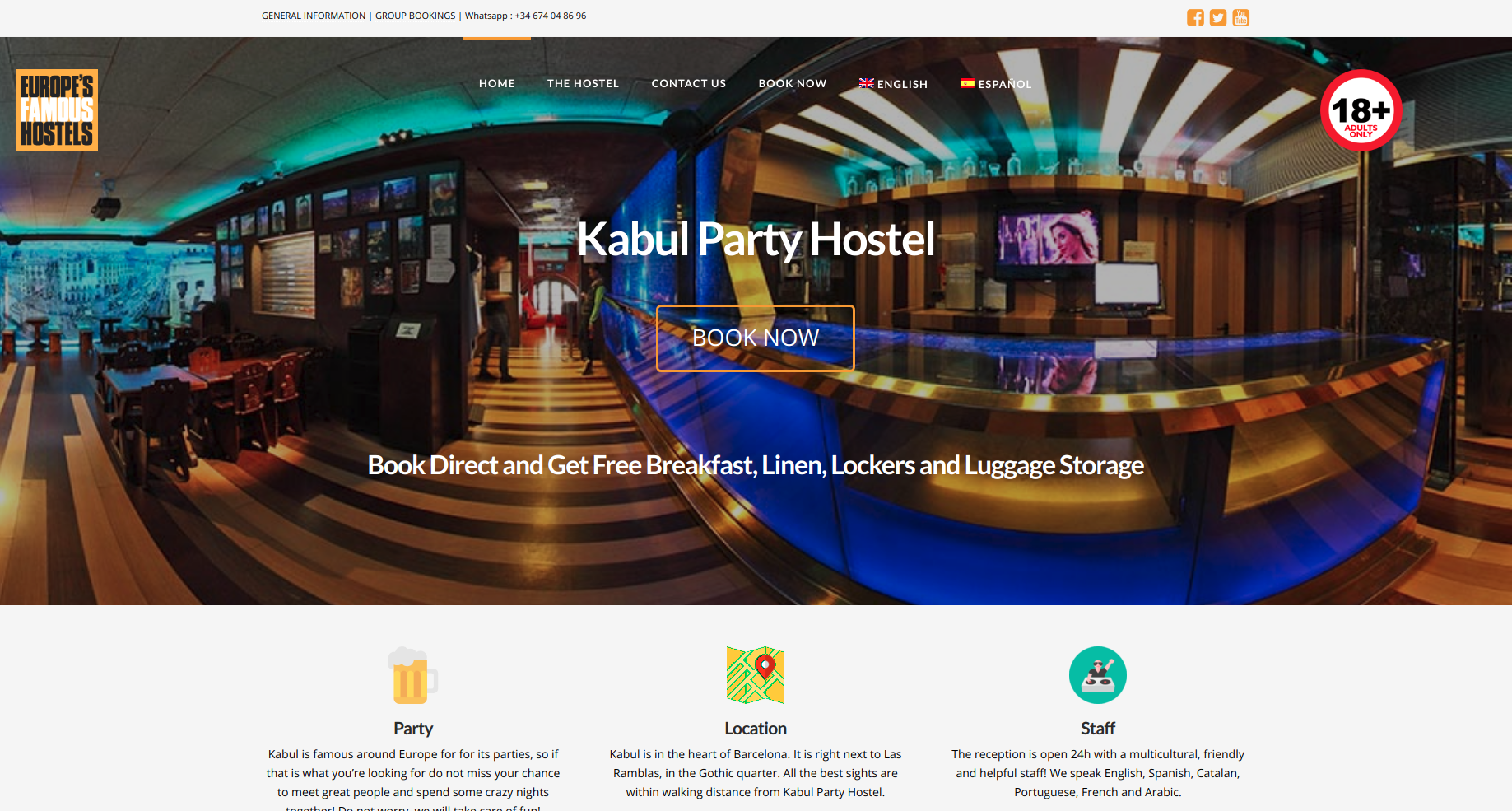
Colour Palette: Yellow/Orange (Brand Colour), Black, White
Font Pair: Lato (Sans-Serif) for Headers, Open Sans (Sans-Serif) for body text
(I would not recommend the font pairing that they have used. Both Lato and Open Sans can be used for both header and body text and as they are so similar I would not recommend using them together like this. Either use one of them for body text and a different font (preferably a serif) for the headers or use one of them for both headers and body.)
Consistency
Let us talk very briefly about consistency in web design. Consistency is a concept rather than a process that we can break down into steps. Consistency simply means that the design, images and content of your website are all congruent with each other. This is overall consistency.
If you have a website about the environment you would strive to use colours and images that are consistent and congruent with the content of that website. What overall consistency does is creates a strong brand image, communicates on all levels what you are about and ultimately builds trust and confidence.
Visual consistency is slightly different. Visual consistency means that the visual elements on your website are consistent with each other. As we do with fonts and colours we choose a font pair and colour palette then use those fonts and colours all throughout our site.
We do the same thing with all of the visual elements on a site like icons and graphics. If you use hand sketched icons in one part of your page you want to use that style of diagram every time. If you use 3D images then you want to always use 3D images. If you use flat images without any shadow then the whole site should have flat, shadowless images. If you define your brand properly it makes it a lot easier to create consistency throughout your website.
Layout / Format
The layout is actually the least important element in design because there are no rules and as long as everything is accessible, it is not that important.
The full page layout with a top navigation bar is very common for websites in almost every industry including the hostel industry. A full page layout means that there is no sidebar and the content is not contained within a box in the middle of the page but the text actually sits against a background that extends to each side of the browser window.
One page websites are also becoming very popular especially within the hostel industry. The reason for this is twofold -
1) Hostel websites do not have a lot of content.
2) A hostel website has only one aim - convert visitors into guests.
Due to the simplicity of a hostel website a full width, a one-page website is often perfect for the needs of most hostels. This does not mean that you have absolutely no other pages apart from the homepage - no. It just means that everything that a visitor would want to know about your hostel can be found on the homepage. They can see the rooms, find out where it is, see the pricing and most importantly they can make a booking, all from the homepage.
If you really don’t have much content to put into your website then a sidebar can be used to break the page up and make the content area a bit smaller. Other than that it is simply a case of personal preference and design choice. Sidebars are almost out of date and only really necessary in a big website with lots of information to navigate.
Another big subject that falls under the banner of layout and format is how to position and structure the elements within your website. This is a topic that we cover in the next instalment of this series - Elements and Functionality.
Summary
That was a lot of information about style and design so let's break it down into a series of actionable steps:
- Define Your Brand - Who are you, what do you offer and why?
- Pick a colour scheme that matches your brand. Usually black, white your brand colour and a colour to accent it.
- Pick a font pair that matches your brand. Use a font pair website to make it a two-minute job.
- Keep graphics and icons consistent throughout your webpage.

